How to Use Color Theory in Travel Photography
Color theory plays a crucial role in the world of travel photography, shaping the way we capture and convey our experiences through images. By understanding the impact of colors and their relationships, photographers can elevate the visual storytelling aspect of their travel photographs to new heights.
When delving into color theory, it's essential to grasp the basics first. The color wheel serves as a fundamental tool, showcasing primary, secondary, and tertiary colors. Additionally, learning about complementary and analogous color schemes can provide a solid foundation for creating harmonious compositions in travel photography.
Colors have the power to evoke specific emotions and moods in photography. By leveraging this knowledge, photographers can infuse their travel images with depth and meaning, capturing the essence of a moment through the strategic use of color.
Color harmony is key to achieving visually pleasing compositions in travel photography. Balancing colors within an image can create a sense of cohesion and unity, guiding the viewer's eye through the scene and enhancing the overall impact of the photograph.
Contrast plays a vital role in making colors pop in travel photography. By understanding how to manipulate contrast effectively, photographers can draw attention to key elements in their images, creating dynamic and engaging visuals that command the viewer's gaze.
Strategic use of color can also serve as a guiding force in travel photography, leading the viewer's eye through the image and shaping the narrative within the frame. By harnessing the power of color, photographers can craft compelling stories that resonate with their audience on a deeper level.
Editing tools offer a wealth of opportunities to enhance and manipulate colors in travel photographs. Adjusting saturation, hue, and color balance can transform the mood and atmosphere of an image, allowing photographers to fine-tune their color palettes to achieve the desired effect.
Colors hold diverse symbolic meanings across different cultures and regions. It's essential for photographers to be mindful of these cultural connotations when incorporating color into their travel images, ensuring that their visual storytelling respects and resonates with the cultural context of the subject matter.
Experimentation is key to pushing the boundaries of creativity in travel photography. By stepping out of their comfort zones and exploring unconventional color choices, photographers can unlock new possibilities and create truly unique and impactful images that stand out in a sea of visual content.

Understanding Color Theory
Understanding color theory is essential for any photographer looking to enhance the visual impact of their travel images. Color theory delves into the science and art of how colors interact with each other, creating harmonious or contrasting effects that can greatly influence the mood and storytelling of a photograph. At the core of color theory lies the color wheel, which categorizes colors into primary, secondary, and tertiary hues, providing a foundation for understanding color relationships.
Primary colors - red, blue, and yellow - are the building blocks of all other colors, while secondary colors are created by mixing two primary colors together, such as green, purple, and orange. Tertiary colors further expand on this by mixing a primary color with a neighboring secondary color on the color wheel. Understanding these color relationships allows photographers to create visually engaging compositions that draw the viewer in.
Moreover, color theory introduces the concept of color schemes, such as complementary and analogous colors. Complementary colors are opposite each other on the color wheel, creating a high contrast and dynamic effect when used together. On the other hand, analogous colors are adjacent to each other on the color wheel, offering a more harmonious and subtle color palette for a softer visual impact.
By mastering color theory, photographers can leverage these principles to evoke specific emotions and moods in their travel photography. Colors have the power to convey warmth, serenity, excitement, or melancholy, allowing photographers to communicate their narrative more effectively through the language of colors.
Emotional Impact of Colors
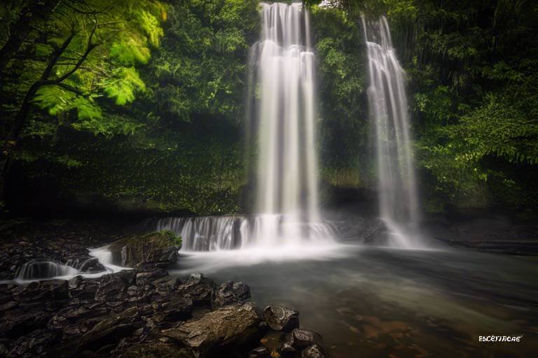
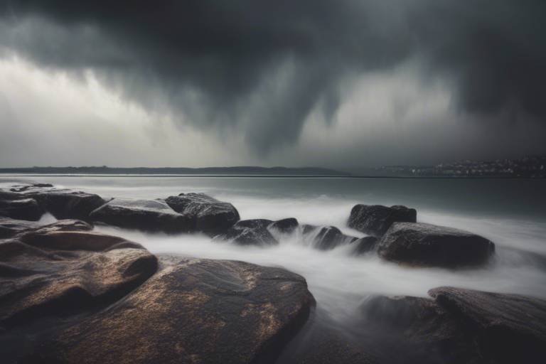
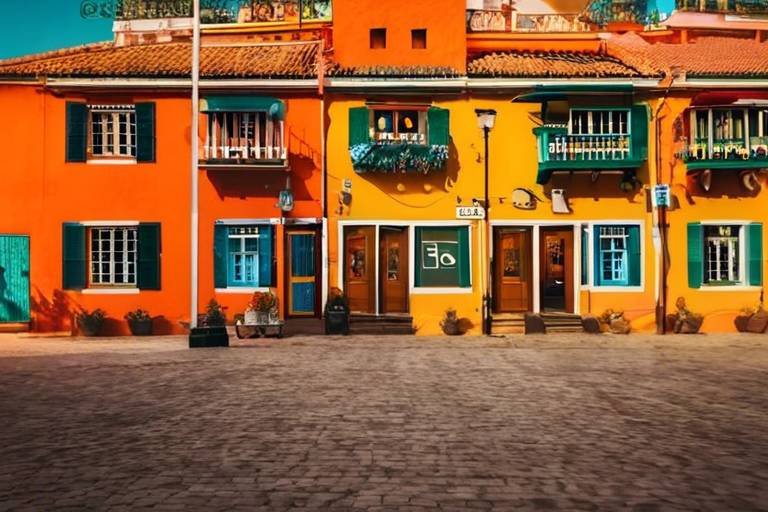
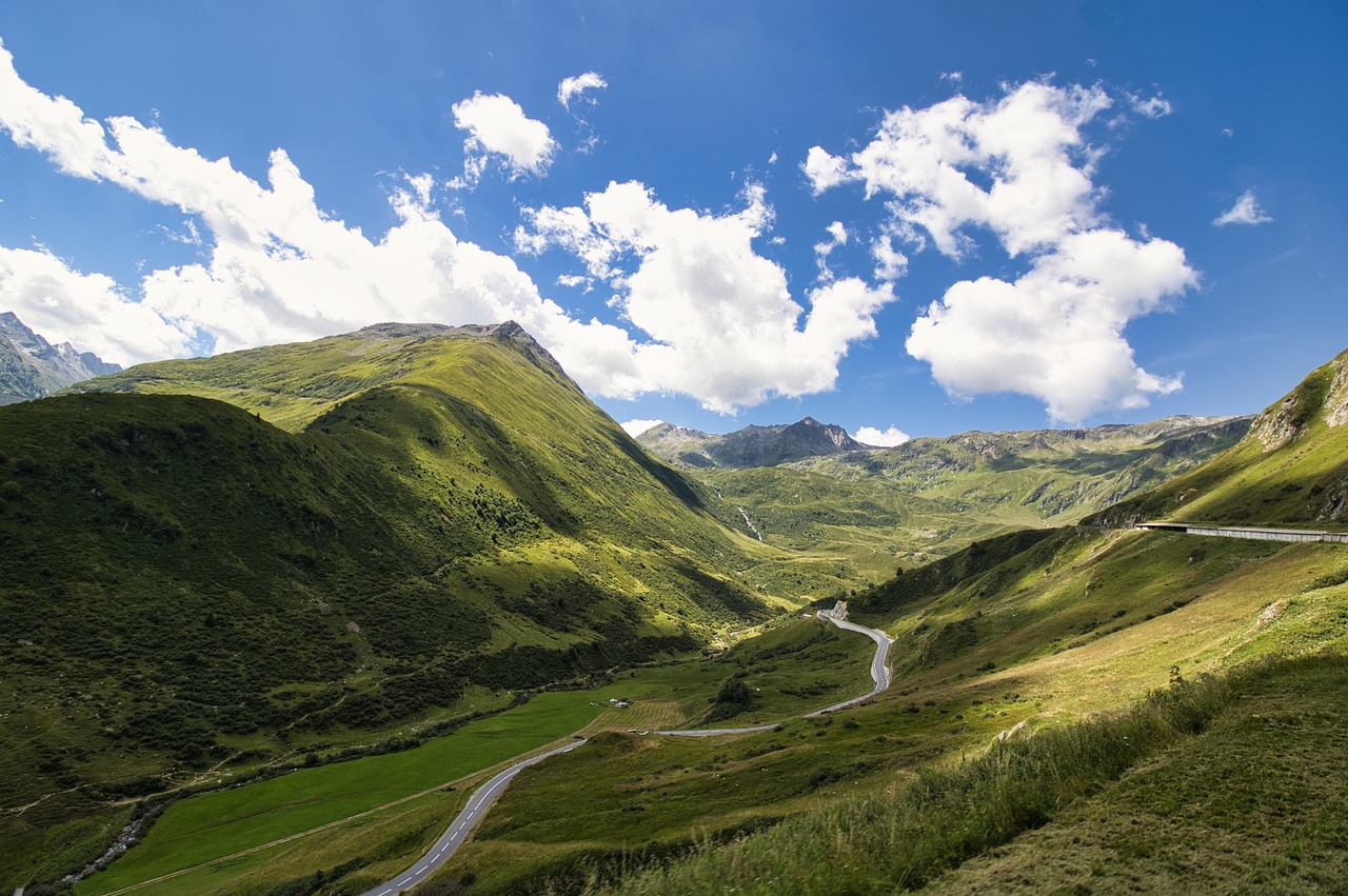
Colors have a profound impact on our emotions and perceptions, playing a crucial role in the art of travel photography. Each color carries its own unique emotional weight, influencing how we interpret and connect with images. For example, warm colors like reds and oranges can evoke feelings of passion and energy, while cool colors such as blues and greens tend to create a sense of calm and tranquility. By understanding the emotional impact of colors, photographers can intentionally use them to convey specific moods and messages in their travel photographs.
Imagine a vibrant sunset captured in a photograph, with its warm hues of red and orange igniting a sense of awe and wonder in the viewer. These colors not only depict the beauty of the scene but also evoke a feeling of warmth and serenity. On the other hand, a tranquil seascape dominated by cool blues and greens can transport the viewer to a state of peaceful contemplation, mirroring the soothing nature of the ocean.
Moreover, colors can be combined to create powerful visual contrasts that intensify the emotional impact of an image. Pairing complementary colors, which are opposite each other on the color wheel, can create a dynamic and energetic composition. In contrast, analogous colors, which are adjacent on the color wheel, can produce a harmonious and soothing effect. By understanding how colors interact and influence emotions, photographers can craft images that resonate deeply with viewers.
When a photographer harnesses the emotional power of colors effectively, they can transform a simple travel snapshot into a compelling visual story that speaks directly to the viewer's heart. By considering the emotional impact of colors in every frame, photographers can elevate their work to evoke strong emotional responses and create lasting impressions.
Color Harmony in Travel Photography
Color harmony in travel photography is a crucial element that can significantly impact the overall visual appeal of your images. It involves the strategic arrangement and combination of colors to create a balanced and aesthetically pleasing composition. Just like a symphony where each instrument plays a unique role to create harmony, colors in photography work together to evoke emotions and convey messages to the viewer.
When considering color harmony in travel photography, it's essential to understand the concept of color relationships. This includes complementary colors, which are opposite each other on the color wheel and create a vibrant contrast when used together. Analogous colors, on the other hand, are adjacent to each other on the color wheel and provide a more subtle and harmonious blend.
Creating color harmony in your travel photographs involves experimenting with different color combinations to find what works best for the mood and message you want to convey. By balancing warm and cool tones, playing with light and shadow, and considering the natural color palette of the location, you can achieve a harmonious composition that draws the viewer in and enhances the storytelling aspect of your images.
One effective technique for achieving color harmony is to use the 60-30-10 rule, where 60% of the image consists of a dominant color, 30% a secondary color, and 10% an accent color to add visual interest. This rule helps maintain a cohesive color scheme while allowing for variation and contrast within the image.
Additionally, paying attention to color psychology can also guide your choices when creating color harmony in travel photography. Understanding how different colors are perceived can help you evoke specific emotions or convey cultural meanings through your images. For example, using calming blues and greens for tranquil landscapes or vibrant reds and yellows for energetic street scenes can enhance the overall impact of your photographs.

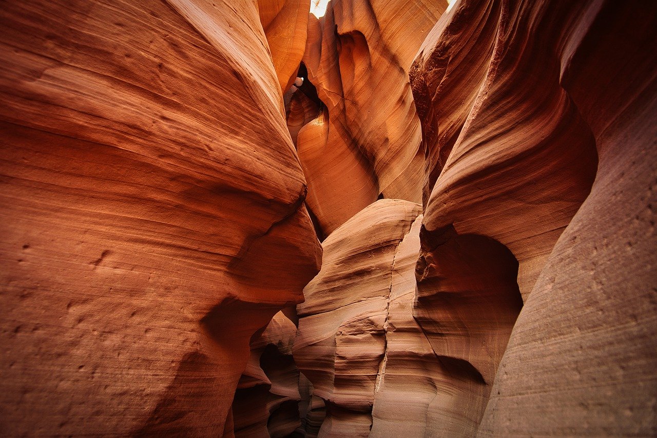
Contrast and Color Pop
When it comes to creating visually striking travel photographs, understanding the importance of contrast and color pop can truly elevate your images to the next level. Contrast refers to the difference in brightness between objects or areas in a photo, and it plays a crucial role in making colors stand out and appear more vibrant. By incorporating strong contrasts in your compositions, you can draw the viewer's attention to specific elements within the frame, creating a dynamic and engaging visual experience.
Color pop, on the other hand, involves enhancing the saturation and intensity of colors to make them appear more vivid and eye-catching. This technique can be particularly effective in travel photography, where vibrant hues can evoke the energy and atmosphere of a destination. By boosting the colors in your images, you can create a sense of drama and impact, making your photos more memorable and engaging to viewers.
One way to achieve contrast and color pop in your travel photography is by paying attention to the light conditions when capturing your shots. Strong natural light can create deep shadows and bright highlights, enhancing the contrast in your images. Additionally, editing tools can be used to adjust the contrast levels and saturation of colors, allowing you to fine-tune the visual impact of your photographs.

Using Color to Guide the Viewer's Eye
When it comes to travel photography, using color strategically can play a crucial role in guiding the viewer's eye through your images. Colors have the power to direct attention, create focal points, and establish visual flow within a photograph. By understanding how different colors interact and influence each other, you can effectively lead the viewer's gaze to key elements in your composition.
One effective way to use color to guide the viewer's eye is through the principle of color contrast. By placing complementary colors or colors with high contrast next to each other, you can create visual interest and draw attention to specific areas of your image. For example, pairing a vibrant red subject against a deep green background can make the subject stand out and command attention.
Another technique is to use color gradients or transitions to lead the viewer's eye from one part of the image to another. By incorporating a gradual shift in color intensity or hue, you can create a sense of movement and flow that guides the viewer's gaze along a visual path. This can be particularly effective in landscape photography, where the natural progression of colors in the scene can lead the viewer's eye from the foreground to the background.
Additionally, you can use color to establish hierarchy within your composition. By assigning different colors different levels of importance or significance, you can create a visual hierarchy that dictates the order in which the viewer engages with elements in the image. This can be achieved through color saturation, brightness, or even color symbolism to convey meaning and narrative within the photograph.
Ultimately, the strategic use of color in travel photography is a powerful tool for creating engaging and impactful images that resonate with viewers. By harnessing the emotional and psychological effects of color, as well as understanding how color relationships and contrasts work, you can effectively guide the viewer's eye through your photographs and craft compelling visual narratives that leave a lasting impression.

Color Editing Techniques
Color editing techniques play a crucial role in enhancing the visual appeal of travel photographs. By mastering the art of color manipulation, photographers can elevate their images to new heights. One effective technique is adjusting the saturation levels to make colors more vibrant and impactful. This can breathe life into a dull image and make it more engaging for the viewer.
Another essential aspect of color editing is tweaking the hue to achieve the desired color tones. This allows photographers to create a specific mood or atmosphere in their travel photos. By carefully balancing the color balance, photographers can ensure that the colors appear natural and true to life, enhancing the overall quality of the image.
Utilizing editing tools to enhance colors in travel photography is not just about making them brighter or more saturated. It also involves creating a harmonious color palette that complements the subject matter. By experimenting with different color combinations, photographers can evoke different emotions and convey unique narratives through their images.
Moreover, color editing techniques can be used to correct any color cast or inconsistencies in the original image. This is particularly important in travel photography, where lighting conditions can vary significantly. By fine-tuning the colors, photographers can ensure that the essence of the scene is accurately captured and portrayed to the viewer.

Color Symbolism in Different Cultures
Color symbolism plays a significant role in different cultures around the world, influencing the perception and interpretation of colors in various contexts. In many cultures, colors hold symbolic meanings that are deeply rooted in traditions, beliefs, and historical significance. For example, in Western cultures, white is often associated with purity and weddings, while in some Eastern cultures, white symbolizes mourning and funerals. Understanding these cultural connotations is essential when using color in travel photography to ensure that your images are respectful and culturally sensitive.

Experimenting with Color in Travel Photography
Exploring the impact of color theory on travel photography, and how understanding color relationships can enhance the visual storytelling aspect of your travel images.
When it comes to creating stunning travel photographs, sometimes it's all about stepping outside the box and experimenting with color in ways you never thought possible. Imagine your camera as a paintbrush, and the world as your canvas. By daring to play with unconventional color choices, you can breathe new life into your images, making them truly unique and impactful.
Frequently Asked Questions
- What is color theory and why is it important in travel photography?
Color theory is the study of how colors interact with each other and how they can evoke emotions and moods. In travel photography, understanding color theory is crucial as it can help you create visually compelling images that engage viewers and tell a story effectively.
- How can I use color harmony to improve my travel photographs?
Color harmony is about balancing colors in your images to create a visually pleasing composition. By using complementary or analogous color schemes, you can achieve harmony in your travel photos and make them more impactful and engaging.
- What role does contrast play in enhancing colors in travel photography?
Contrast is essential in making colors pop and stand out in your travel images. By adjusting the contrast levels, you can create a dynamic visual impact and draw the viewer's attention to specific elements within the frame.
- How can I guide the viewer's eye using color in my travel photographs?
Strategic use of color can lead the viewer's eye through the image in a deliberate way, creating a visual narrative that enhances the storytelling aspect of your travel photos. By using color to create focal points and leading lines, you can guide the viewer's gaze and convey your intended message effectively.
- Are there any cultural considerations to keep in mind when using color in travel photography?
Colors hold different symbolic meanings in various cultures and regions, so it's important to be mindful of cultural connotations when incorporating color into your travel images. Understanding the cultural significance of colors can help you avoid unintentional misinterpretations and create respectful and culturally sensitive photographs.
- How can I experiment with color in my travel photography to create unique images?
Experimenting with unconventional color choices can push the boundaries of creativity in your travel photography and help you stand out from the crowd. Don't be afraid to try new color combinations, play with saturation levels, and explore different editing techniques to create visually striking and original travel images.